Wednesday 27 September 2017

Gnome Alert (3)

And yet another batch of illustrations for my upcoming children's story The Garden Gnome's Journey. This is the lot, I think; still have to do a cover picture in color. Barring any unexpected troubles, the book aught to be available soon.


My other book, a youth adventure novella titled The Ten Horns, is available here:

The Ten Horns

Tuesday 19 September 2017

Gnome Alert (2)

Another batch of illustrations for my soon-to-be-available children's book The Garden Gnome's Journey. Watch this space for updates!


My other book, a youth adventure novella titled The Ten Horns, is available here:


Saturday 16 September 2017

Gnome alert

Some illustration concepts for my upcoming children's book "The Garden Gnome's Journey." Watch this space for updates...


Thursday 7 September 2017

A new book

After endless delays and editing and proofing, copies of my youth adventure novella The Ten Horns are finally available. Here are the front and back covers:


Copies can be ordered here:

The Ten Horns

The book is also available on Amazon, but the page there apparently takes a few weeks to build to completion, so at present, the synopsis and "look inside" features are not functional yet.

As I note above, it is youth fiction and suitable for readers at around grade 7 level, though I have known an adult or two who also told me they enjoyed it. Perhaps they were just being polite!

The first few chapters are available for free here.

Edit: The Amazon page is functional now:

The Ten Horns

Tuesday 5 September 2017

Four Capsicums

Oil on board, 20 x 15 cm:


Been enjoying playing around with the rich colours and textures of wood. I have long enjoyed this sort of "kitchen still life;" perhaps time to do a series...

Tuesday 22 August 2017

Blue, green and red

A dilapidated old table and chair, repurposed for outdoor duty. Such things are full of character and irresistibly paintable. Oil on board, 25 x 20 cm:

Monday 21 August 2017

Potted plants in a courtyard

Oil on board, 20 x 15 cm:


As I may or may not have noted in an earlier post, this theme of outdoors, but intimate spaces, currently appeals to me. Not too sure what one should call this sort of painting: it's neither landscape not still life, but something in between. I my just do a whole series.

Friday 18 August 2017

Does choosing to go on vacation mean you don't enjoy your work?

This question was asked on Quora :

Does choosing to go on vacation mean you don't enjoy your work?
It gave me an excuse for a bit of random philosophizing in my answer:

Not necessarily. We should really look at this from an evolutionary point of view. Early humans were hunter-gatherers. The very concept of work versus leisure did not really exist for them. They just lived. Some of the time they would do things necessary for survival, like hunting and gathering. Sometimes they would just sit around telling stories or singing and dancing, though those things were to some extent also important, forming part of religious rituals or serving as training for the young.
What is striking about their lifestyle though, is its variety. You never knew what the day would bring. Perhaps a good hunt? An attack by a neighboring tribe? Discovery of a bee nest full of honey? Sudden rain?
We tend to think of a life without TV, cell phones and internet connection as one of relentless boredom, but I suspect that “primitive” people actually enjoy more excitement than most of us, simply because there is no set, absolutely predictable routine. I further suspect that this partly accounts for the popularity and addictive nature of social media: it mimics this unpredictable environment. You never know what direction a discussion will take, or whom you will meet next.
Now people who enjoy their jobs are people who find their jobs as interesting as hunter-gatherers find their environment. There are new things happening and new challenges every day. Still, going on vacation makes for yet another bit of variety. Of course, for people who don’t like their job (very often because the job is boringly predictable) their occasional vacation is the only thing that keeps them going.
My uncle was an artist. He loved his job. But he too would have a vacation once or twice per year, during which time he would quite deliberately avoid drawing or painting, just to recharge the batteries, let ideas simmer a bit, and do something different. Now that I work mostly as artist myself, I find the same thing: I love it, but I also enjoy taking the weekend off and getting something else done. During such times I often cook up new ideas for pictures too, so it is not time wasted.

Wednesday 16 August 2017

Cat and Sansevieria

Oil on board, 25 x 20 cm:


A subject I have taken something of a liking to lately: this sort of not-quite still life, perhaps in a courtyard somewhere. I kind of prefer living plants to cut flowers in vases, and I may just get it into my head to do some more of this sort of thing.

Tuesday 8 August 2017

A few photos

I now and then indulge in pseudo-artsy photography with my humble point-and-shoot camera. Some of the latest ones:

The aloes are in bloom at the moment; makes for an attractive sight in our otherwise rather monotone winters:


There are nevertheless signs of spring in the air. These peach blossoms reminded me of Van Gogh's famous painting of the same subject:


Around here, because of a rather high rate of crime, people tend to live behind high walls and ugly electric fences. Thus, the only way to take a nice photo is to tilt the camera up a bit:


Sunday 6 August 2017

Landscape with Quiver Trees

Had a desperate struggle with all manner of administrative crises, notably trying to get service out of a bank. Hopefully that is in the past now, so on with a bit of painting. Oil on board, 20 x 25 cm:


Quiver trees are found in some of the drier areas of southern Africa, and are actually a species of aloe. They are so named because indigenous people used their bark to make quivers for arrows.

Thursday 20 July 2017

Cape Cottages

Fisherman's cottages, Western Cape. Pen and watercolor, 5 x 7 inches:


Tuesday 18 July 2017

Flying Things

Studies of marabous:


And a helicopter:


Pen and watercolor on printer paper.

Friday 14 July 2017

And a few more

Some more random sketches in ballpoint pen and watercolor, on printer paper:


Wednesday 5 July 2017

A few random sketches

Some sketches in watercolor on printer paper (which works perfectly fine for watercolor sketching, if you don't mind a bit of warping and they don't have to last into geological time):

Loosely copied after an original by Pieter van der Westhuizen (1931 - 2008); I went straight into the watercolor without making any sort of preliminary sketch, so it's not exactly accurate. But it forced me to loosen up a bit, which was partly the point.


And a similarly loose copy after an oil by Maggie Laubser (1886 - 1973), whose work I admire:


Sketched from various reference photos; I first made the sketches in ballpoint pen and then filled them in with a few washes of color:


Sunday 2 July 2017

A Medieval project (6)

After last week's decoration of the manuscript, all that remains is to bind it. Book binding dates from around the first century C.E., and started out in rather simple fashion, evolving over the centuries into more elaborate and sophisticated forms. However, even modern hardcover books are bound in ways not all that different from the late Middle Ages.

This picture show relatively basic medieval book binding, in which quires are stitched together and to the cover:


In this example, the binding is more advanced (note the coloured stitching around the end):


Book covers could include clasps to hold the book closed:


Covers ranged from fairly plain to very elaborate:


For my own manuscript I decided to keep it as simple as possible, because I did not have suitable equipment at hand. I had neither thread nor needle, so I decided to use relatively thick twine (which is perhaps more authentically medieval anyway!). 

I wanted to stitch the quires together using this sort of cross-stitch technique:


Lacking a needle, I used a wooden skewer to punch holes in the backs of the quires, and then threaded the twine through by hand:


It took some doing, and the result was inevitably not too neat. For the cover I followed a procedure based on that followed in some early medieval Coptic codices, which is to simply glue the cover to the outer pages of the manuscript in this way:


I made a simple cover from cardboard, then tightened up my cross stitching and glued the cover on:


Not the most sophisticated of books, but I learned quite a bit in the whole process.

Other parts in this series:


Tuesday 27 June 2017

A Medieval project (5)

In the previous week we just practiced a bit of writing; for this week, students were supposed to write and decorate a text. We only had to write one or two pages, but I didn't like the idea of ending up with a mostly empty manuscript, so I was determined to copy out and illustrate my entire chosen text, namely the poem The Lady of Shalott by Alfred Tennyson (1809 - 1892).

We were supposed to base our decorations on actual medieval manuscripts, but were also given some freedom to improvise, so I did a bit of both - some of my pages are more in the style of medieval work, while others are decidedly modern. I looked at some actual manuscripts to see how some specific decorations, that I wanted to try out, were done.

This one gives one a sense of the style of illustration used, as well as the elaborate stylized leaf pattern decoration (known as rinceau) used in the margin:

Calendar from a Book of Hours, in Latin, on vellum [French Flanders (perhaps region of Binche or Mauberge), c.1450]

This one shows several things: more rinceau design, a decorated initial and some marginal drolleries. These were bizarre, humourous and sometimes blatantly obscene pictures found in the margins of many medieval book pages:

Crucifixion Scene from a French Book of Hours (c 1470) 133x93mm

Here a historiated initial, i.e. an initial with a picture in it. In this case it is an inhabited initial, where the picture is a human or animal:

Illuminated Manuscript, Book of Hours, St George, Walters Manuscript W168

This page shows another form of border decoration, where pictures are more realistic and less stylized:


The poem I copied consists of nineteen verses of nine lines each, and thus, using one page per verse, I could keep pretty much the same layout for every page. Every page contains a decorated initial, and a rubricated one (where an initial is written in a different colour for emphasis - traditionally red was used, but I used other colours as well). I also included an illustration on most pages, and all the pages contain border decorations, some fairly medieval in style, others more modern.

I used modern materials such as watercolour and acrylic paints, and modern ink, but I used a fairly old-fashioned dip pen for writing. I am not at all versed in calligraphy so I just used a "normal" handwriting, but tried to keep it neat and legible.

Here then are my illuminated pages (click on the pictures for the full-sized view), with comments on some of them:

Medieval scribes often used gold leaf for illumination. Unlike medieval scribes, I am not rolling in money, so I used gold craft paint instead. Unfortunately one cannot see the glitter in these photos. In the image below, the decorated initial has quite a bit of gold in it, but it comes across as light brown in the photo. Same thing happened with all the other pages where I used the gold paint:


In this page, and one of the others, I tried some Celtic knot designs in the margin. These were popular as decorations in some medieval books. Unfortunately, they take ages to do, so I had to limit them:


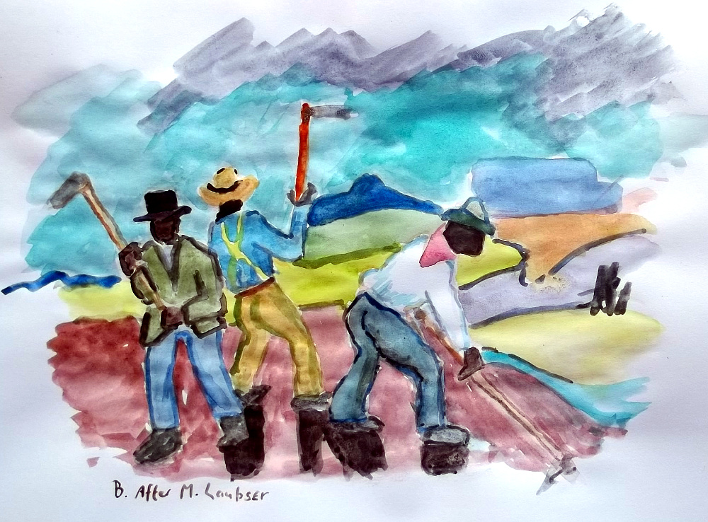
This page contains a historiated initial: the Lady of Shalott makes an appearance in the decorated letter O. The reapers were roughly copied from an original painting by Maggie Laubser (1886 - 1973):


The plain, abstract design behind the weaving lady was often used in medieval manuscripts. Also, I paid no attention to proper perspective, because that is what medieval artists would have done:


The stylized leaf designs here are only vaguely based on medieval examples; I made more authentic-looking ones in other pages. 


The border decoration here is an anachronism; tomatoes were unknown in medieval Europe. I did try to get the characters' clothes to look more or less medieval:


The blue colour in the text area is an artifact introduced by the camera, that I couldn't work out how to remove; the original page is white. Also, the darker stars are actually done with gold paint, but one would never guess in this reproduction:


In the poem, several pages are devoted to the appearance of the knight; I didn't want to draw the same character over and over, so I stuck to decorations for some pages, in this case trying my hand at somewhat more authentic-looking rinceau:


The knight on a snail in the left margin is my attempt at a drollery:


The illustration here was roughly copied from the famous original on the theme of the Lady of Shalott, by John William Waterhouse (1849 - 1917):


In the pages above and below my border designs are decidedly un-medieval. But the scroll in the illustration below is not: in the days before speech bubbles, such scrolls were often used to indicate what people were saying:


As in the case of Sir Lancelot, several stanzas of the poem are about the lady floating downriver, so instead of drawing the same picture over and over, I stuck to decorative designs:


And finally, the end, with an illustration that is not exactly medieval in style - I actually found it rather difficult to imitate the medieval style, and developed a new respect for forgers!


Other posts in this series: